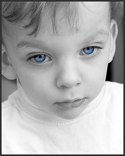
I just read the comments on your photo and I guess you got slammed by the “Don’t like selective desaturation” people.
What a sweet kid, I really like the angle you choose for this portrait, and as far as I can tell the rest of the PP is also fine.
The photo has good sharpness and great focus on the eyes.
There’s not realy that mutch to say about this photo that could improve it.
The lighting is good, no distracting shadows, the background isn’t distracting.
I guess that most people would have liked this in full color, selective desaturation can be a great thing to shift attention to a specific part of your photo, but as far as I can tell, the eyes are already the first thing you look at. As srbrubaker commented, they overbalance the photo.
I can only say that I like it, and yes, I guess I would also want to see it in full color, but the way it is now is also good.
Keep up the good work.
Peter
If you have any questions, comments or other things about this critique, or are bored and want to spam someone just PM me
It's a really strong expression, and it is beautifully lit and exposed. I'm afraid I find the blue eyes to be just too strong. I think they overbalance the photo.
Kinda creepy. Perhaps a bit overprocessed....even though this is probably what you were going for. I think that toning the blue down a bit, stopping down a bit (to get a little more detail in the cheeks), and also having your model look at the camera would have made it much more powerful. Just my two cents. Cute kid and nice crop.
The effect really shows off the kid's eyes. Unfortunately he looks like he's about to fall asleep. Because of this the result seems closer to "undead zombie child" than "blue eyes win blue ribbons".





 Add photograph to your favorites
 Add photographer to your favorites

 Photographer found comment helpful.


