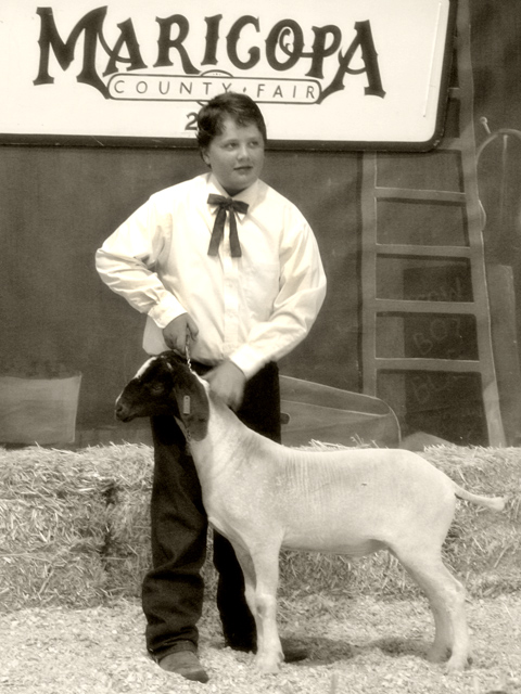
This is such a nice photo that tells a story. I really like your framing and choice of 1600iso. The sepia tone finishes off the nostalgia look perfectly. It could have been 1955 instead of 2005. Nice work.
I think you have received some very helpful comments thus far regarding this image. The sepia toning does work quite well here - it gives it the proper mood for an old western-type feel. The subject does seem to be slightly out of focus, and a tighter crop might have served well here as well, although this one is not necessarily bad. Because of the subject's uncomfortable pose and facial expression, the shot seems maybe slightly off-balance and another shot a few seconds later when he seemed more relaxed (looks like he is making some kind of movement here) may have worked as well. One thing to always keep in mind is that a blurry image will almost certainly suffer in the scores, whether it is minor or not (or even intentional). Hope this helped, and happy shooting!
Cool idea for the challenge. The kid (human one) is not entirely focused and his shirt appears yellowed. A full sepia treatment on this could have worked.
It seems like the boy's face is not in focus, or at least not as sharp as it could be (the sign is more in focus, and yet I keep wanting to look at the boy's face). Nice desat and sepia. Good luck in the challenge!
His shirt seems overexposed & his face is out of focus. you seem too far away to get a good zoom. The shot would be improved, IMO, by framing along his elbow, top of head, sheep's bum, his knees. I expect this was a tough shot as you were probably across an arena & unable to get a good enough zoom for focus.
The soft focus in this doesn't seem to add much - maybe a shallower DOF would have made it stand out a bit more. I also think the composition could have benefitted from using the rule of 3rds. The highlights are also a bit strong. 5







 Add photograph to your favorites
 Add photographer to your favorites

 Photographer found comment helpful.


