|
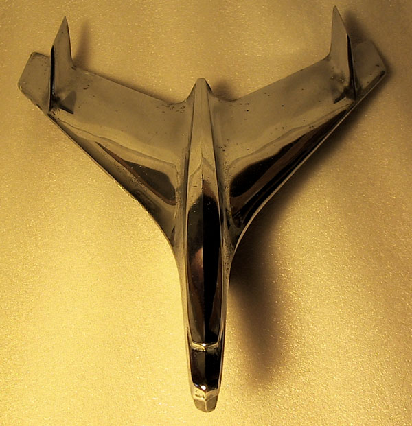
Nice example of symmetry. In my opinion, this shot could be improved mainly through different lighting (the top right corner seems kind of dark, and the main shadow takes some of the emphasis away from the main subject.) Also, while it is perfectly vertical, (I checked) the spacing at the top gives the impression that it it is not straight in the shot. Overall, quite nicely done! |






 Add photograph to your favorites
 Add photographer to your favorites


