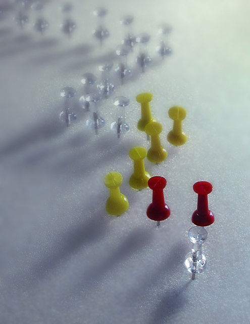
Nice "tacktical" diagram from a yacht racing manual :-) The overall softness of it is sort of odd, and (to pick a nit) the tangency of the foreground pin witht he first red pin is offputting to me.
I find all the transparent pins - especially the out-of-focus pins - to be quite beautiful. While I am usually bowled over by yellow and red used together tastefully - as they are here, I find myself wondering whether the photo would not be much more visually appealing if all the tacks were transparent. I understand it would mean losing one layer of meaning from the title, but I think it might be worth it.







 Add photograph to your favorites
 Add photographer to your favorites


 Photographer found comment helpful.


