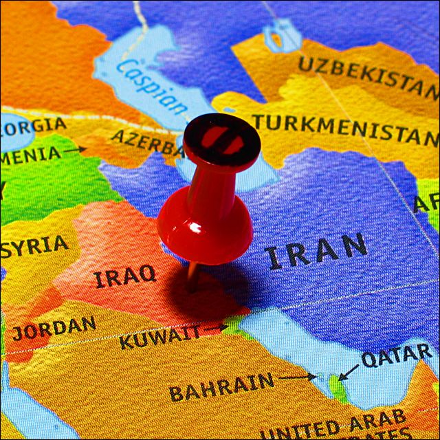
Very nice crisp focus on the map. The detail in the texture is awesome. Very nice texture.
You definately met the challenge in my opinion. There is a tack in the photo. Nothing said it had to be more than one tack. Despite what some people thought.
The Tack does seem to be a little bright and too red to me. There is a distracting light glare on the tack and the red is very overpowering.
The 'no' sign on the tack is original and makes this stand out from other shots similar.
The shadow from the tack kind of distracts and 'hides' the point where the tack goes into the map. Maybe a side light could have helped ease the darkness of that shadow a bit.
Overall a nice image, not one I'd hang on my wall, but fitting for the challenge. ~Heather~
Good one! I think the "no" sign drawn on the tack is the only detracting element, because it's not as well done as the rest of the photo. I'd love to have seen a peace sign there. Also, perhaps the title: "No pre-emptive a-tacks!". The rest is obvious and left to the viewer.
Neat concept and composition! Very creative! I find the shadow of the tack a bit distracting, but maybe that's part of the point of the political statement.
Ahhh. Political statement. But there are no TACKS in this image! ;) Like the 'no' sign on your tack. Clear, in focus, uncluttered. The tack is a little too shiny from the lighting but a good effort. 6 from me!






 Add photograph to your favorites
 Add photographer to your favorites

 Photographer found comment helpful.


