Thanks for all of those great comments. And the bad ones as well :)
Regarding the composition I wanted to to something differend. Some of you didn't like how she was looking out of the picture. But I liked it and thought it looked all right.
Regarding the up the nose shot. People have noses and after looking through several Vouge's and other magazines in more than half the pictures you could see up the nose of the model. I don't like it when you can see nosehairs but seeing a nose and black hole isn't that bad I think.
Some people said the tacks were facing the wrong way. But if you read the title "Fortress around your Mind" the tacks are supposed to face out to protect the mind. That was the plan.
Thanks again for all of those great comments. Glad so many of you liked it and saw what I was trying to show you :)
This picture made me stop, that's always a good or a bad sign.
It's creative, it's a good photo, I like your crop, the title makes sense, I like the graduated background. It doesn't tell me anything, but then, tacks is a realy boring subject, you made something out of it. Hope to see you on the frontpage in a bit.
Good luck.
I don't get the story behind this picture but maybe that doesn't matter; it's a very strong photo, nevertheless. I love the contrast of the pale-skinned woman(Gwyneth Paltrow?) against the orangey-red background. Having her in the corner of the photo is great, makes the tacks against her skin stand out. Also, her blue eye looks bluer due to the blue tacks in the picture. One distracting element, I think, is her earring. But otherwise a great shot. 9
Your model needs to work on her posture. Her intent gaze off-screen is intriguing, and her placement in the frame creates a strong impression. I can't decide whether short, spiky hair would add or detract from the rest of the presentation. This is easily my favorite shot in the challenge so far.
-----
Coming back after voting on all of the other entries; this is still my favorite.
I have never seen such a great divide between the best shot and the rest in any challenge. The best concept, the best execution and the best model. I really like the off-balance in the photo and that the model is looking outside the frame. The gradiation is nice. The only thing I can think of cnanging is the colour of the tacks, a single colour such as red or white. Anyways great work -10
Love the lighting here, and the very unusual crop and use of dead space works very wekk indeed. Great stuff. Are your lovely model's eyes actually that blue, they are beautiful.
Ouch, Oh, Euw!. Oh, nevermind - they are pointed away... There are no TACKS in this image! ;) Great composition, interesting use for tacks. Hopefully you didn't use superglue! Love the fad onthe background, the curve of her neck. 9
Brilliant stuff. I'm guessing this is by Arnit. (if I'm wrong take it as a compliment) The composition makes this a ribbon pick for me but the lighting and theme are excellent too. One of my few 10's. Brilliant.
I am not saying I could do better but there is one thing that really bothers me in this shot and that is the fact that half her face is out of the frame and the other half is looking out of it. Cool that you should break "the rules" like that but still it isn´t working here IMHO. Otherwise, flawless lighting and contrast/sharpness/colours. Gave it an 8 and I wouldn´t be surprised to see this on the front page in a week or at least in the top 10.
(ef þetta er ekki mynd eftir Árna Torfa skal ég hundur heita)
I love the lighting in this shot. The quality of light and focus in this shot is absolutely professional. Sure the concept is weird , but the shot is really nicely done. :-)
Wonderfully orginal both conceptually and compositionally. Takes a veryhigh score from me, I hope others are open enough in their thinking to accept all that negative space for what it is and what it does to the gravitas of the image.
this looks very much like arnit's pink entry.
could it be he?
lighting is nice, idea is characteristically weird. not sure I like how the UL corner is noticeably darker than the rest, but perhaps it helps hold together this very unorthodox composition.
Is this Arnit's? Didn't you put her through enough in the Pink challenge? Now you have tacks on her face! lol
This is very cool. The red background works nicely here, and she looks beautiful as always even with tacks all over. Nice job.
I would have really liked this had you composed it like your Pink entry. It's a great idea, but I don't care at all for the way you placed her in the frame. The cut off face, and up the nostrils shot is not very appealing and distrcats from your concept.






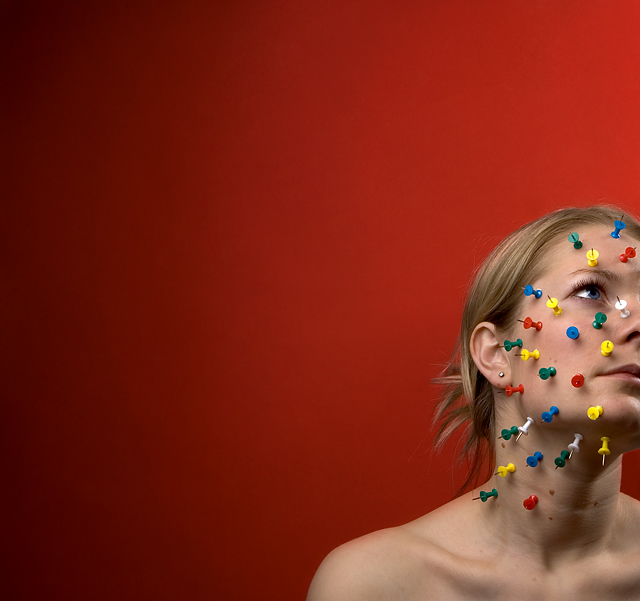
 Fortress around your Mind
 Add photograph to your favorites
 Add photographer to your favorites

 Photographer found comment helpful.


