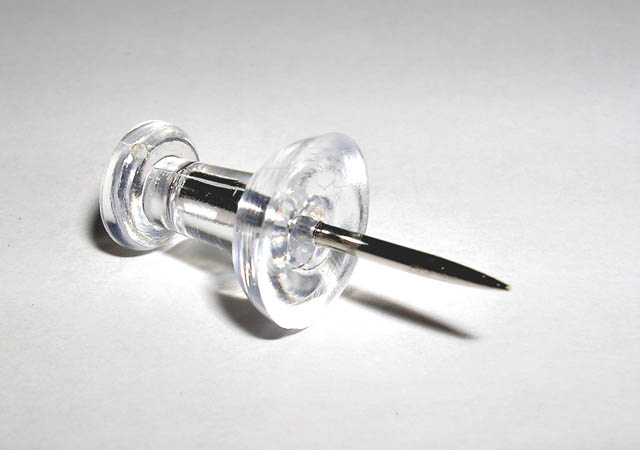
Put tack on a white sheet of paper, removed noise, balance contrast, and voila! Short and sweet. Tried to get the background whiter, but it wasn't working right. I'm still more or less pleased with this picture. :)
Statistics
Place: 55 out of 137 Avg (all users): 5.5571 Avg (commenters): 6.4545 Avg (participants): 5.1977 Avg (non-participants): 5.7895 Views since voting: 1423 Views during voting: 320 Votes: 219 Comments: 15 Favorites: 0
I like the simplicity of this image. I wish you could have found a way to make a whiter background work though. I think it would go nicely with the clear tack. A whiter background would make the tip stand out a bit more I think, and that would be a good thing.
I like the focus and clarity here. I think that the detail in the tack is fine in my opinion.
The shadow is a slight bit distracting, I can really picture this as a high key kind of thing with no shadows and white background. I think it is the area along the bottom of the tack that makes me want to see it all this way. See how it is a little 'too bright' compared to the rest of the shot? I think instead of wishing that were darker, I wish the rest of the photo were lighter. Doesn't usually happen that way for me, but I think this could be good like that.
I like the angle and framing/cropping you chose. having the pin at a diagonal creates visual appeal and with the large part of the pin toward the upper left, it also offsets it enough to not appear 'dead center'.
Overall I think this is a really good shot, nice to look at and well done. ~Heather~
Very simple and very nice. One thing I did with my entry that I think would have made this even stronger would have been to burn in the shadow a bit. It would have added more dramatic contrast. Love the clarity and simplicity. Beautifully done.
Clean and simple. I like it. You're probably taking a little heat for not having 'Tacks' (plural), but it's fine in my book. The bottom front of the pushpin is a bit hot, but tricky to avoid. It looks like you used white paper for the background and it's coming across a little noisy. You know it's not, but the paper makes it appear that way. Neat Image could have ironed that out a bit for you. Overall, great job. Good luck!
I get your point but there are no TACKS in this image! ;) Excellent focus, good macro. I think it would be better with a different color background - the white overwhelms the image. But the composition and POV are good. 7 from me!
It seems your DOF is too shallow and that the tip is ever-so-slightly out of focus. I'm guessing some will say the light is too harsh, but I think it works.






 Add photograph to your favorites
 Add photographer to your favorites


 Photographer found comment helpful.


