COMPOSITION
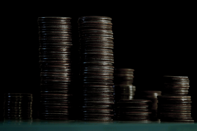
The composition here is strong with the two towers of quarters being the primary item of focus and them being located on the left third. The small stacks also adds to the effect.
TECHNIQUE
While I find the green strip at the bottom a little distracting, I don't think eliminating would serve to help. The focus is fine, but the picture does look a little dark to me. I think some colored lights (blue, etc) shining onto the tower at various points would have made this shot a lot more interesting.
OVERALL EFFECT
I think this is a neat idea, it just needs a little more light to be truly effective. Good work.
with all those dimes, and the patriotic theme, you kinda gotta work the word liberty in there somewhere, eh? but that's just me. this is a nice photo, like the stacks in the horizon, nice touch there.
That's a lot of quarters! Focus seems pretty good. Image is overly dark, even of this dark subject (title, which seems a bit of a reach). Suggestion - crop the bottom (green) off. 6 Swash
Good use of your money. Nice lighting technique, although it leaves everything kind of dark and unfocused. You should have raised your camera up from the table a bit so as to be on "even ground" so to speak.
Personally I find any kind of made-up-photo of the World Trade Centre to be of Bad Taste at this time in World History, but that only in MHO>
This really doesn seem very dark - and I like dark shots, and my monitor is set up OK. Not sure that the pile of money is going to be well-recieved though.







 Add photograph to your favorites
 Add photographer to your favorites

 Photographer found comment helpful.


