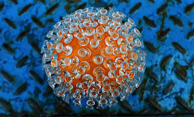
Awsome photo! Nice contrast of the blue/orange. I think the texture in the background creates another element that gives this photo depth. Congrats on the top 10 placing!
Wow. I can't believe all the negative comments about the background. Maybe I'm weird but I thought that made the image. Imagine it on plain white like so many other images here at DPC. You would have ended up last or close to it. Excellent job and excellent choices!
Now that had to take some time :) Nice job on the orange, the background I'm not too wild about, it takes away from the orange which looks really cool with all the tacks. Good choice of clear tacks too, by the way
I thought this was very cool, and a unique idea ... but I didn't get the background ... it takes away from the main focus. My eyes keep straying to the background, thinking ... "What the heck is it?"
Cool! I was going to do this! But I was using REAL tacks so the final result was not as good. ;) I like what you used for a background. Can't remember what its called but it provides great texture here. Competes a little with the tacks, but the color works beautifully with the orange. Centered composition - many would say its a no-no. Forget them - the real rule is that a composition needs to be balanced. You achieve that with your color choice. Also, people believe center compositions don't provide tension. Again, yours is in the color and texture choices you made. I like it. Its hard to make tacks interesting. 9 for your use of color and comp. Focus and DOF and POV great, BTW.
You definitely spent some time setting this one up. Very interesting. I am not sure about the backround choice but none the less this is a very creative and well done execution of the challenge. Good job.
Love the object, don't care for the background. Feelliek it could have been a little more luminous. Nonetheless, a strong entry and a strong score from me.





 Add photograph to your favorites
 Add photographer to your favorites

 Photographer found comment helpful.


