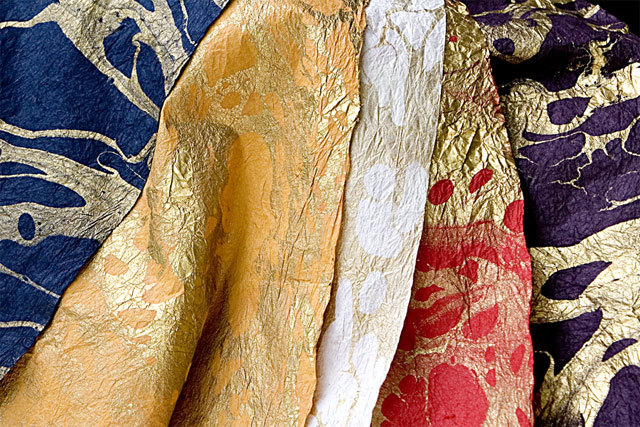
General: My first impression is of the colour and texture displayed in your image. Also, the separation between each piece of paper make nice leading lines.
Composition: The placement of the lightest coloured paper seems a bit to central and makes the image feel a bit out of balance. Three pieces of paper may have worked better (blue, red, gold). Also, since the separation lines are vertical the image may have worked better with a vertical composition to emphasize these lines.
Exposure: The exposure on the blue and red paper seems right however on the others there seems to be too much glare therefore reducing the contrast between the gold leaf and the paper itself. A different shooting angle may have improved this.
Impact: The vibrant colours of the paper is what brings the impact to this image however the lightest colour paper feels out of place as it draws the viewers attention from the others. The lightest colour in a field of darker colours will always draw the viewers attention.
i agree! I bought some for this challenge, but didn't end up using it. maybe in the future. this has nice color and texture to it, but no real focal point to draw in the eye.





 Add photograph to your favorites
 Add photographer to your favorites

 Photographer found comment helpful.


