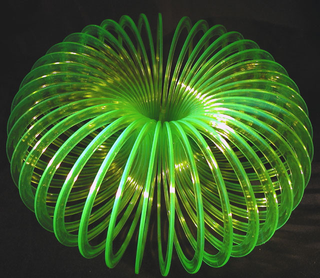
Composition: Very good. Even though the object is symmetrical, the non-symmetrical lighting adds interest, as well as it not being perfectly centered vertically. The contrast between bright and black works well for this shot.
Technical Quality: This would be the area I would suggest needed improvement, basically the overexposed areas from the bright lighting. I like that the shadows are minimized and even with 2.8 aperture, the overall image looks well-focused.
Creativity: The lighting works for you in this area, also. Slinky's have been used a lot on this site, but I think it is how you use them that matters most.
Overall: A very nice photo, think the score is right on. I also did a slinky for indoor macro, but yours is far better!!
If you have questions, or comments, please feel free to pm or em me. Kandice
Good use of the slinky, and it's symmetrical on many levels. But there's something lacking - perhaps the lighting? How about the same object back or sidelit?






 Add photograph to your favorites
 Add photographer to your favorites


 Photographer found comment helpful.

