Crop, dodge/burn, hue/sat, selective color, neat image, usm, high pass,
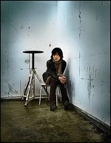
I took this shot the day earlier
And each time I looked at it I imagined how cool it would look if there was a person there, so thats the story behind this shot. This the classroom where I have my art class (Im a student in a drawing class) and this is a friend in the class who agreed to sit for me.
Statistics
Place: 19 out of 251 Avg (all users): 6.5081 Avg (commenters): 8.2000 Avg (participants): 6.4426 Avg (non-participants): 6.5726 Views since voting: 1967 Views during voting: 410 Votes: 246 Comments: 37 Favorites: 3 (view)
This is a great shot, I really like the overall feel of the picture, the moodiness of the person works well with the surroundings. I read your comments and find it hard to think of this as a classroom area, the walls are so bare and such. I'm used to lots of things all over the place.
I read the comments below and really can't add much to them. I love the shot and even though I didn't get to it during the challenge to vote, I would have given it an 8. The points off would have been one for the title, while it fits the background it certainly doesn't fit the person inside the shot :) And two for the dodging and burning done around the edges and such. The way you left the bright light go up the center bothers me personally for some odd reason, maybe if it was more balanced with the bottom. I agree about the cropping, it's perfect, nothing to change there.
Hope my comments help, not that you need any help with this one! Great job!
That's a crying shame the place you got. This was my favorite photograph in the contest and I strongly believe it should have won! I completely disagree with a previous comment that the bottom should have been cropped. It would have taken away from the distance between viewer and subject, an aspect that was a favorite of mine. I absolutely love the blue light that radiates from the center, not to mention I'm a sucker for scrappy looking places! ;-) Congrats on your top 20, though.. even if you should have gotten better!
EXCELLENT colors and texture. Like the lighting as well.
Hahahaha!!! Now I have company with my photographing the students. Too bad our art rooms aren't new thus, I don't have this excellent textured wall as a backdrop.
Interesting concept. But for some reason I get the feel of a dark circle around the whole image. Such as it was intentional to darken, rather than being intentional lighting. Still good!
This photo has a nice mood to it. I also think the centered subject works nicely in this composition because of the mutiple leading lines. Excellent shot...
Interesting image. Curious as to what the title has to do with this person? I would have cropped about 1 to 1.5 inches off the bottom and right for composition.
OK what can I say about this? The lighting is harsh, not what one would expect for a portrait, the subject is small in the frame, again not what you would expect. I like the unexpected, shows creativity one thing that seems to be in short supply in this challenge. Very well done (8)
I love this one - such a great atmosphere, and so much attitude. There seems to be very slight oversharpening, but that really seems to work in this case; the colours are awesome, and the faint vignetting makes the feel of it that much better. Spectacular work!
v. coole. I like it. a little harsh on the dodging around the model, but the concept is strong enough and the scene cool enough that I don't really care about that. Centred composition was absolutely the right choice here in my opinion.






 Add photograph to your favorites
 Add photographer to your favorites


 Photographer found comment helpful.


