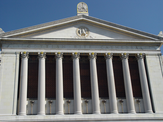
Composition: The subject is very nice, but you took the photo from slightly off-centre. You probably should have taken it from head on, or way off-centre (making it look deliberate). The result is a slanted horizon line (especially obvious across the bottom) - which a lot of people vote harshly. Other than that, the framing is very good and well balanced and the piece of blue sky adds nicely to the subject.
Technical Quality: The exposure is great - the sky looks wonderful. The sharpening is spot on - not over sharp, nor soft. Focus is crisp. As mentioned though - the horizon is crooked which has cost you dearly.
Meeting Challenge: There's plenty of obvious symmetry in this photo, so no problems with meeting the challenge.
Creativity: I like the building and the small spots of yellow really got me thinking. Did you saturate the image to achieve this, or is that the natural colour balance of the building? (No problem - just curious)
Border / Title: No border - none required. The title is pretty good, but I didn't understand the "Marching" part - perhaps because of my nationality.
Overall: It's a very good image minus the crookedness aspect. You could even try a rotate in an image editing program - although it won't quite fix it. Well done though.
Composition is OK - could have made the edges more defined, Exposue is a little flat - I expect this was very bright - in very bright scenes, the auto exposure actually tries to make it neutral gray, so you need to "over expose" it to compensate. The picture needs to be squared up - either at the time the picture is taken or with post processing.
Interesting building. It's got about 4 degrees of tilt that need to correct. I also miss being able to see the top of the building. Living in a city full of white marbleish buildings, I'd also suggest trying to shoot this at dawn/dusk. You get some great colors that really intensify the impact of the image.
Crop is alittle tight for my taste, and the whole feeling is off balanced.Perhaps backing away some and lowering your angle or fitting in just the upper half would have worked better. Nice try though.
Very interesting perspective. Looks unlevel on bottom but level on the top. I'm not sure what to make of it. I would have cropped tighter and rotated a little to the right.





 Add photograph to your favorites
 Add photographer to your favorites


 Photographer found comment helpful.


