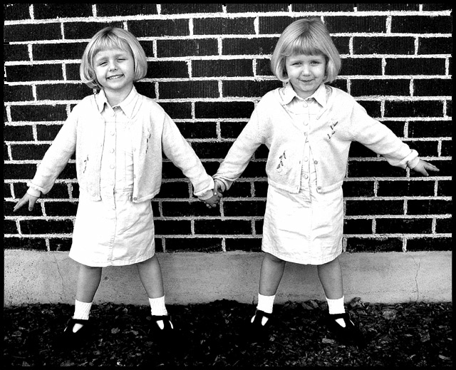
Well, what a cute picture :) I'm glad I got this one, as it shows symmetry in a different way. The subjects of the two identical twins is inspired, and they make perfect symmetry in that they are well... identical.
Somebody mentioned the picture didn't seem quite straight, and I agree with them. If you look at the background of the shot, you will notice the white behind their legs tilts a tiny bit. It's so marginal, but it makes the picture look a tiny bit wonky.
Likes and dislikes? Well, I think the light coloured outfits they are wearing were a tiny bit over exposed, and a bit of white balance would have helped quite a bit. I like their pose, and how natural they look; a set up candid. I don't like how the feet melt into the ground, you can't see their shoes, they almost look like little trees. I actually like the background, it's perfectly symmetrical, and adds to that aspect nicely.
I like this photo, well done, good idea, and good luck in the future challenges.
-Annida
cute and glad to see each 's own personality comes through in the picture. I would have tried to rotate the pix to get the brickmore on a horizontal plane.
GREAT idea and a lovely shot. I think my only criticism is that the contrast was pushed too far and we've lost both detail on the young ladie's clothes and their feet disappear into the ground. But that's a minor niggle and I can see that you were trying to make them as white as possible - which you succeeded at doing. Great idea and great results. One for your wall if these are your own kids! 8 - floyd
With twins, I'd have chosen a more traditional approach, like a cheek to cheek picture or something. Unfortunately they aren't quite symmetrical but they sure are cute kids.
Awesome shot. I bet a print of this would be phenomenal. The high contrast really works well, even if the whites are a bit blown out - it adds a surreal feel to the whole thing. Fantastic. 10
Cute shot. But skilled as well. I like how you've overexposed the girls' dresses, giving them a paper doll look. But their faces are still sharp and individual. Nice take on the theme!






 Add photograph to your favorites
 Add photographer to your favorites

 Photographer found comment helpful.


