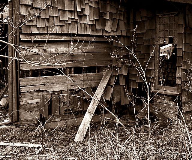
Shot with Canon 24-70 2.8 L lens, at 24mm.
Edits:
- Cropped, and flipped horizontally
- Adjusted curves
- Doutoned
- Converted back to RGB
- Hue/saturation
- Resize
- USM for contrast and sharpness
- Final tweak of curves
- Save for Web
Statistics
Place: 100 out of 500 Avg (all users): 5.6137 Avg (commenters): 6.5385 Avg (participants): 5.4508 Avg (non-participants): 5.8594 Views since voting: 1345 Views during voting: 417 Votes: 321 Comments: 13 Favorites: 0
I'm torn on this one.
Some of it I don't like (harshness of the post-processing) and yet enjoy studying it. It's a busy shot with a lot of little details that weren't lost in the shadows.
Well seen (6)
One of the more acceptable sepia treatments I have seen in this challenge and I am bumping you up two points for that and the composition since reveiwing my scoring.
I looked and studied this one for a long time. The mechanics of the shot are flawless. I like the B&W, it's crystal clear as far as focus. DOF is great. The plank leaning against the wall provides a great angle, but I think the photo is too cluttered. There is way too much going on but nothing appears to be a focal point. Keep at it.








 Add photograph to your favorites
 Add photographer to your favorites


 Photographer found comment helpful.


