Greets from the Critique Club:
Initial Impression:
Simple, Effective, lacks "something".
Challenge:
This meets the challenge perfectly.
Composition:
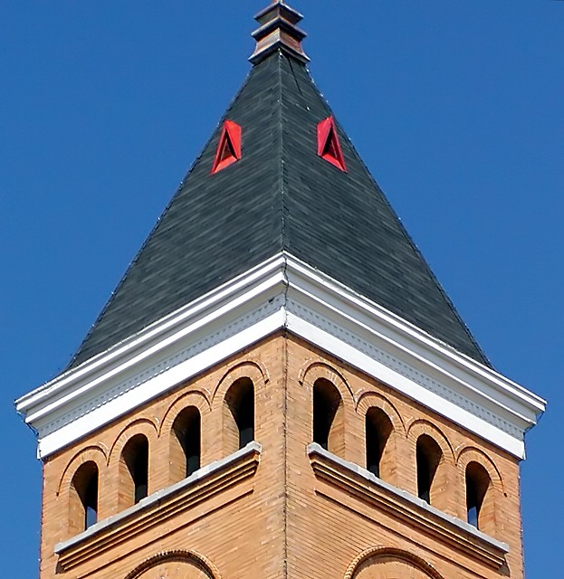
This is both the strength and the downfall of this pic in my view. On one hand, the composition makes the symmetery perfectly obvious, but on the other it makes it a little bit boring. Including more of the sky, both on the sides and the top, might have made the photo a bit more interesting. I really like the illusion that's created by the symmetry - it makes the viewer feel as if the tower has no depth to it. I also really like the little bit of red on the windows, it serves as a counter-balance to the blue skies.
Camera/Post-Processing:
Nothing noticibly wrong here, which means it was well done!
Overall:
This photo has grown on me as I look at it longer... I still think it lacks the much cited "wow" factor, but it's a very nice picture none-the-less. Good job!
-Matt |






 Add photograph to your favorites
 Add photographer to your favorites

 Photographer found comment helpful.


