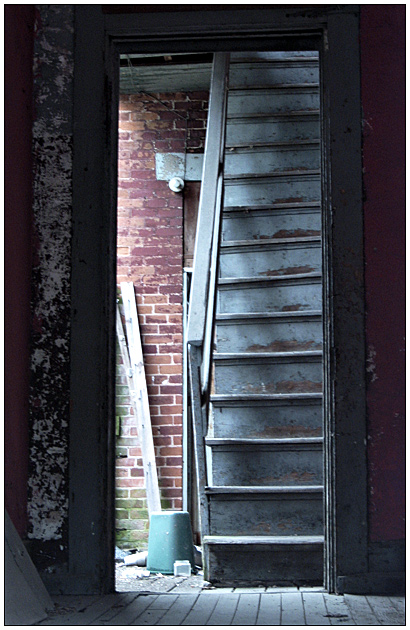
Somehow the gap between what the title tells us and what the photo tells us frustrates. Something about the stark vertical and horizontal lines makes parsing the photo difficult - there's no natural movement from one place to the next. Don't know if there would have been a way to get away with that had some part of the photo really caught the eye, but it's so subtle and understated that it's really hard to get drawn in. I wonder if it would have been better a little oversharpened or oversaturated. Or whether the subtle textures would have been better expressed in B&W. Or whether the composition would be less static if the door were not centered in the photo.





 Add photograph to your favorites
 Add photographer to your favorites


 Photographer found comment helpful.


