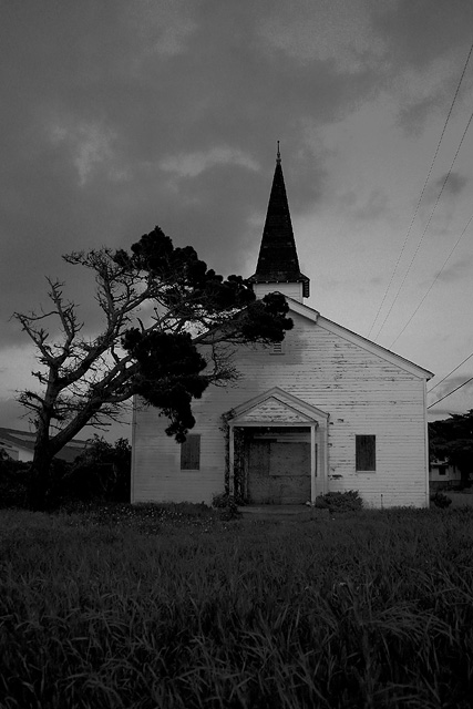
Very grey - and I can't really see a reason for not using that range of whites above your brightest point. From the look of the shadows on the church front, there ought to be detail in those trees available, rather than a simple silhouette. If it was mood you were after, I would suggest that a greater range of contrast to bring out the clouds, and perhaps enhance some sense of texture on the boarding might have been more effective. This seems, especially as it all darker than the background on which it's displayed, simply to be underexposed.
A really neat old church. You should think about putting the subject anywhere but smack dab in the middle of the picture. I would have like it cropped closer as well.







 Add photograph to your favorites
 Add photographer to your favorites


 Photographer found comment helpful.


