Greetings from the Critique Club
By Inspzil
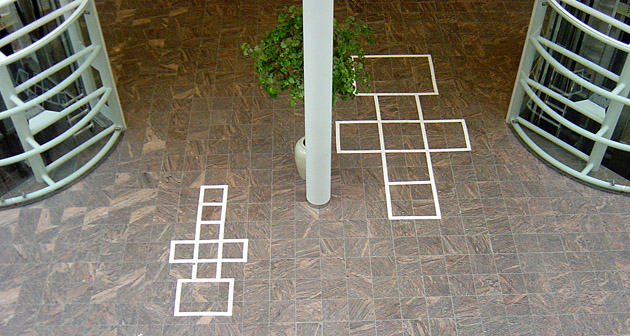
Composition - There definitely is symmetry in the building, but I don't see a lot in terms of the squares on the floor. The little one looks like the junior version of the big one, but still slightly different. I'd say it mostly meets the challenge, so we'll leave it at that. While the photo is not perfectly symmetrical, it is pretty well balanced. I think the plant in the middle is a little distracting, but also a good source of color aside from the floor color. The thing about the composition here is it just doesn't have anything there to grab me. I keep looking around the photo for something that isn't there. Its not a bad composition, just seems to be missing something.
Technical - Good exposure, framing DOF and pretty sharp. Nothing really wrong here but it could be a little sharper.
Overall - Not a lot to say about this one. I like the balance and framing of this picture but I think the symmetry part is a little off and think that adding a couple kids in there or something would detract the attention from that. Maybe put a big kid on the little squares and a little kid on the big squares. But maybe you don't have any kids handy to throw in there. I guess I'm trying to say that I like the idea but it still needs something. Good luck in future challenges - Inspzil |







 Add photograph to your favorites
 Add photographer to your favorites


 Photographer found comment helpful.


