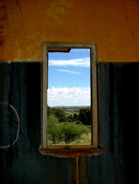
A nice shot but in this challenge there was a lot of window views (this being one of the better ones IMO). Altho I'm no expert I would have prefered to see the whole picture 640 X640 to get a better feel of the room I'm looking out from. It's got great clarity and some beautiful colors. It's centered to the frame yet kind follows the rule of thirds and has a great view. Personally I think this would have done better in a windows challenge. The overhang in the window is very distracting and if the shot was taken from a higher angle or perhaps a different perspective that could have been eliminated. Personally I just would have liked to see more of the room. Goodluck in this challenge.
A FANTASTIC photograph - extremely well done, but unfortunately, I don't think that the particular view you selected epitomizes the abandoned building that is obviously there. I really hate to rate your photograph low (compared to others - because it's a VERY captivating image), but you can't see the "abandoned building" very well. Sorry... :-/
You were on the right track with this one. I like the composition. The contrast is a bit too much (darken the highlights and brighten the shadows). More minor the roof bit int he upper left of the window detracts.
I like this photo for its colors and for the idea. I wonder whether the photo might be better with just a touch more view, and with the window not dead center. I'm impressed that you got detail in the sky and detail in a black, interior, unlit wall.
This is simply amazing. I've only viewed a few, but this is the best shot so far in the abandon buildings contest. I love the contrast here. The colors are great. The composition is simple, but technically the subject has been placed all around the image with the background in the middle.
The middle does seem to draw a lot of attention, but there's a few things on the outside surrounding wall that bring the eye out.





 Add photograph to your favorites
 Add photographer to your favorites

 Photographer found comment helpful.


