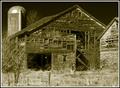
i like the black and white of the picture, i think it goes well with the good contrast level you have.
as far as composition, i would have put the doorway exactly in the middle along the horizontal axis because it is slightly to the left or i would have put it farther to the left to be in accordance with the rule of thirds.
Great composition. Your choice for making it a B&W was a wise one in my opinion. I was going to comment about the arch being too centered, but the windows in the background shift things in a pleasant way.
Well Done!






 Add photograph to your favorites
 Add photographer to your favorites


 Photographer found comment helpful.


