My favorite comment on this is "This building looks empty". I think what they are trying to say is "This meets the challenge perfectly" since what you were suposed to capture is an abandoned building. lol
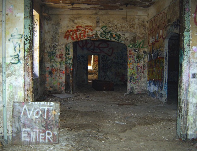
Anyway, I like the view a lot. It's something about the doors that really makes this interesting for me.
The color is good, and although the colors are bright, the building is still dark and dreary. It's not a happy place at all.
Focus and clarity are good. I like how we can see detail in the graffiti all the way into the building. This also adds nice depth.
I think there is a lot to look at in this shot, without being cluttered. The sign doesn't really look set up to me. I mean, it WAS set up by someone, but I feel that it was not put there simply for the photo. The sign could indicate that someone uses the building though, and does not want 'strangers' inside messing with their business. Still, the building has long since been abandoned as it's original use, which after reading your location, see that it's a hospital, and that makes it even more creepy I think. lol
Lighting is alright. I like how it goes from light in the front and as we venture in through the doors it gets darker and darker.
A very nice capture of a very interesting place. Congrats.
~Heather~
Man I dont know why but I just felt it again that shiver up my spine when I looked into this photo.. just kididng... but it could if I was there and your photo makes it feel as though I am standing there.. Wild place.. Great capture I think this should have placed higher though.. Its cool to see the words there Not Enter.. makes it all more abandoned.
I like your idea, something about having the doors all centered in the picture though seem to make it static and doesn't hold your attention as well as you want it to.
This building looks empty. Not much of interest going on in the photograph, but I really like the color in it. Like the perspective of looking through door after door, drawing one's eyes to the center of it. Nice lighting.
Interesting shot. The overall composition works well for me. Their is an "ominous" mood set with the sign and the darkness. I'm left wondering what might be down that black pathway, especially curious about the light deep within. Nice job.






 Add photograph to your favorites
 Add photographer to your favorites


 Photographer found comment helpful.


