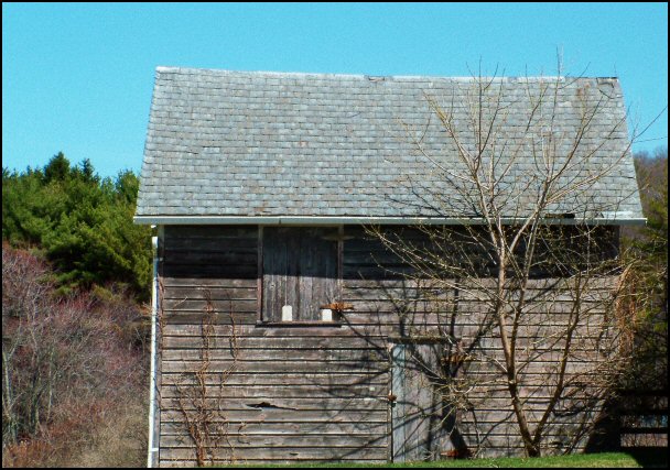
The angle is kind of "ho hum" to me. I think it would have been much more dynamic at a different viewpoint. I would have also liked to have seen the bottom of the building - the lower left is cut off.
Flat composition without a lot of visual appeal except for the lovely contrasting colors. Perhaps an angle which shows the barn next to the empty tree and empty sky, thrusting its roofline upwards...?
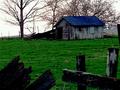
Nothing too special here. The composition is ok, and the subject is nice but that's about it. It just needs more. A better sky and better lighting for the most part.






 Add photograph to your favorites
 Add photographer to your favorites


