AFTER THE CHALLENGE:
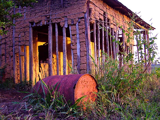
This is really interesting... I desaturated the greens & yellows here and people are commenting the saturation is overdone. Also, there was a color variation of increased red, which basically was a post process way of compensating for sunset lighting. Also, the purple hue is simple from the sunset shadows... five minutes after this shot, it was dark. Anyhow, all I am saying is the colors are pretty accurate. If I could reshoot it, I would pull out the big weed in the lower right to show more of the building.
The rusty 50 gallon drum made the shot for me.
Statistics
Place: 112 out of 500 Avg (all users): 5.5594 Avg (commenters): 5.9630 Avg (participants): 5.3744 Avg (non-participants): 5.8480 Views since voting: 1243 Views during voting: 441 Votes: 320 Comments: 29 Favorites: 0
i would have liked it more if the color was a little more subtle, the colors are great colors that go together very will, just would look better muted some. i am very often guilty of over-saturating my colors. nice image and good capture of the light.
Good photo. It has nice lines. The barrel adds a lot IMO, ads a nice secondary subject and helps to draw the eye into the structure. Great colors, processing or did it really look like that? either way, pretty cool. The gold and purple really work together well for me. Looks like lighting wise, you chose a really good time of day. Great job.
I don't feel the purple colors do justice to this otherwise very interesting picture. I like the sun on the back wall. The exposure and sharpness look pretty good. I'd liked to have seen just a straight shot. Good POV.
The contrast of this photo has blown out most of the clarity o it could be from over processing it. I'm also not fond of the composition of the shot as it is just there and doesn't draw your eyes into the photo. Perhaps stepping back from the building a little bit to show a little more roof line would have made for a better photo. Good luck in this challenge.
Like the composition. The color's are just too vivid for me to really appreciate this photograph. Not something I see in nature. Maybe just a little less saturation/hue next time. Just my opinion.
Nice job. It is not always true that tweeking the saturation will produce an interesting photo from an ordinary one. Iin this case, I think the lines and textures are strong to begin with; but boosting the saturation a lot has given the photo a real boost. I'm finding most of the stuff in the right quarter of the photo cluttered and extraeneous. Would it be just as good, I wonder if the right were cropped more?
Nice shot. The soft colors are very nice. Pretty good composition too, although I think maybe more sky could have been put in, but then again the sky doesn't look too great in this shot.
Also, there seems to be a lack of focus (as in actual focus by the camera, not a subject focus). Still a nice shot.





 Add photograph to your favorites
 Add photographer to your favorites


 Photographer found comment helpful.


