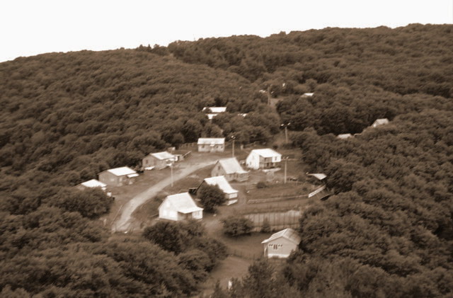
Not sure the toning works in this shot. The main subject is a bit too centered and also blurry/out of focus. Having a ? mark in the title doesn't help in my opinion, but it's only a title and took nothing away because of it.
Picture is really unsharp. Hard on the eyes to view. It looks like it was on manual focus instead of auto (at least that's how mine look when that happens.) This isn't caused by resizing. Would have been a good picture.
Not sure if its abandoned as it seems to be quite out of focus to tell? Would be improved though by bringing up the levels as the image overall is grey / dull- no apparent colour
Probably just me but I didn't understand this photo. It just looks like a community to me and doesn't say anything toward being abaondoned. The images is quite blurry as well. Thanks for the entry.
Out of focus. Not enough detail to really get the feel of the buildings or to determine if they're in use or not. Feels overprocessed because of the color.
It's a shame this shot is so blurry - it's a really nice composition and a break from the norm. I really like the clearning in the trees and the angle you shot it. Maybe try using a tripod and taking several images of the same thing, experimenting with focus. This works well as a monochromatic shot - but may have been even better in straight black and white, increasing contrast slightly in PhotoShop if you have it. 4






 Add photograph to your favorites
 Add photographer to your favorites


 Photographer found comment helpful.


