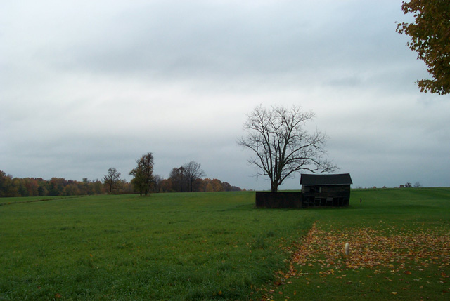
Pleasant, but not the most effective composition or coloring. Too square on - I might have moved several feet (yards?) to the right, and angled it so the building line wouldn't be right along the horizon.
I think this is an interesting building. I wish you would have moved in on it. This turned out to be more of a landscape picture instead of a building picture. Nicely done though
Somehow the negative space in this photo doesn't work for me. I think part of it is that everything is a little bit too dark. You might consider using curves or levels in Photoshop to make everything lighter: certainly the subject, probably the sky, possibly the grass. I see the subject is placed neatly on the rule of thirds. It's a safe choice, but I tend to think that it's a little small to fill that space. I'd have been tempted to move it toward the corner by cropping off the tree on the right and an equal amount of grass - but I tend to crop more closely than the DPC group as a whole.
I like the bare tree and its relation to the house, and I think if you'd have been able to get closer or to use a longer lens, a shot with just the house, the tree, and the grass would have been better.
your building is a little dark to see what it is represinting in the challenge which is a shame as the image is good, would have cropped the tree out at the top right as it looks unbalanced.
Unfortunatetly, all I can see here is sky, grass, and an out of focus, too dark , too small building. The tree limbs in the upper right corner should be cropped out. The angle seems ok, but a closer, tighter, lighter shot would have scored much higher from me.
The colors are very nice. It's kind of hard to tell that the house is abandoned as it is so small compared to the rest of the picture. I think taking a closer shot would have been nice - you could see the decay of abandonment.
Nice, simple shot. I like how the dead tree hovers over the building. The sky is dark and forboding, but lacks contrast. Also, the building is a bit too dark for its own good.





 Add photograph to your favorites
 Add photographer to your favorites


