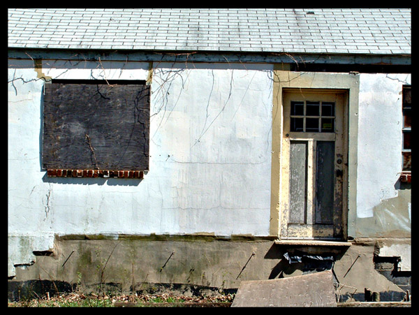
I was obscenely happy when I saw this challenge, because there are four or five old abandoned houses/storefronts within a couple of blocks of my house. I'm the only one who thinks they give the area personality.
--
-Adjusted levels, colors, and contrast
-Sharpened
-Cropped
-Added border
Statistics
Place: 402 out of 500 Avg (all users): 4.6475 Avg (commenters): 5.0000 Avg (participants): 4.5480 Avg (non-participants): 4.7966 Views since voting: 855 Views during voting: 365 Votes: 295 Comments: 9 Favorites: 0
A couple observation on this image.
A good part of the white "plaster" seems to be washed out, and the right tilt of the roof line and wall is a bit distracting. The balck border is competing with the gutter area, and may have been better in white with a 1 pixel line on the inside edge of the white.
Take a look in my portfolio for examples of this type of border if you care to. I use it a lot and often gives an image an actual photograph look to it.
Looks like you ran into the same problem I did - what line to square the image up by when the whole building is caddywhompus? I like this picture, a lot. However, the roof line not levelling with the frame is distracting to me. I'd like to see greater saturation, too!






 Add photograph to your favorites
 Add photographer to your favorites


