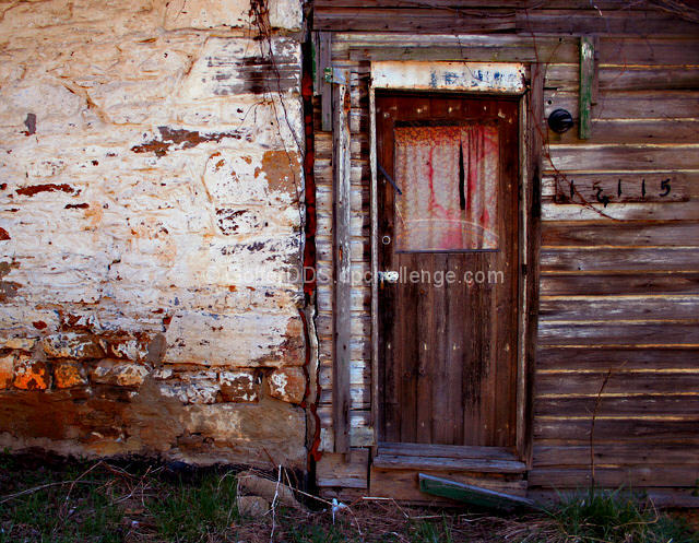
I had taken this picture originally for the April freestudy. When the "Abandoned Building" challenge came up I felt it would be better suited for that challenge. I went back to the site where I had taken the picture several times at different times of the day in order to get the lighting to my liking. The picture was cropped, colors slightly saturated, and sharpened.
Statistics
Place: 292 out of 500 Avg (all users): 5.0372 Avg (commenters): 5.7778 Avg (participants): 4.8743 Avg (non-participants): 5.3009 Views since voting: 1155 Views during voting: 383 Votes: 296 Comments: 9 Favorites: 0
This building has a lot of character, but I don't like how you cut this in half with the two different textures. The wood looks like the more interesting of the two, so I would maybe have tried to emphasize that more by moving over and showing more of the wood side of the house. Hope that makes sense, it's late and I'm crosse eyed from voting :)
Great composition. I find the colors a little flat. Curtains in the doorway window make me wonder if the building abandoned. Will assume it is. Just a little sharper focus perhaps. Nice photograph in general.
Classic shot of a doorway that you did pretty good with. Instead of such a low key composition, I might have lightened it just a touch. I think it would have brought out a little more detail in that very interesting door.
personally there is nothing about this shot that would suggest the building is abandoned. It does look old but not abandoned. Perhaps a different view or angle could have improved this. It does have excellent colors and for the most part has clarity. Good luck in this challenge.







 Add photograph to your favorites
 Add photographer to your favorites


 Photographer found comment helpful.


