Let's see how I can say this.
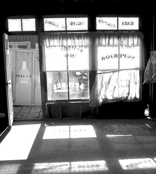
I'm not sure the post-processing was done like this on purpose, but the image is far too bright/contrasty in my opinion. The highlights are blown-out (unrecoverable white with no detail in it). Image is a bit tilted to the left also, making it a bit awkward to look at properly.
Shame this was an open challenge as some burning & dodging could bring this one out a lot better.
The "Fragile" sign looks funny in contrast with the curtains hanging down at the window. Great how the light falls an creates the profile of the facade on the floor.
The contrast/brightness of this photo makes it very hard to look at. It also doesn't appear to be abandoned in my opinion but vacant. Perhaps from a different agle would have produced a better shot.. Good luck in this challenge.





 Add photograph to your favorites
 Add photographer to your favorites


 Photographer found comment helpful.


