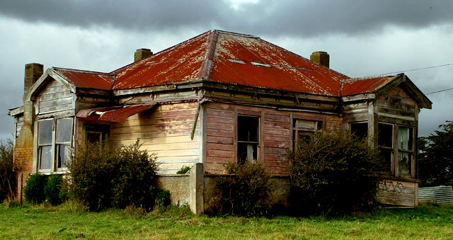
Nice photo you've got here. Unfortunate for the basic editing rules, or else you could've gotten rid of the telephone lines coming in. I do think it would look better in a duotone sepia photo or b/w though, and maybe with a little more in the frame besides just the house.
I am one of your 7 "10" votes. I really liked this shot, can't believe it didnt score better. I would prefer the power lines cloned out on the right side. I hate power lines. If I didnt love electricity so much I would lobby to have them taken down, they have messed up so many of my shots! anyway... nice work and I look forward to seeing more of your work.
I like your point of view, lighting, color and like how you cropped it. I wish it was sharper, but still, the overall photo is very nice. It pulls me in.
Nice house. What I don't like about this picture and few hundreds of other photographs in this challenge is that this is 'just' a photograph of a house and there doesn't seem to much value added by the photographer.
One thing I would probably have tried here would to be to close to the building and shoot it straight on and show the the texture of the walls, those nice windows and the bushes in front of it. (The rightmost window seems particularly interesting.)
Another possibility would have been to wait for nicer weather and go back for a reshoot with some blue sky and clouds and perhaps take a vertical photograph showing the sky.
I'd also have tried to move a bit back and try to show the house in it's surroundings and keeping the house to the left or the right part of the frame instead of having it dead-center.
Including some foreground in the picture might also have helped it.Perhaps there was a sign here or a fence or a nice rock on the ground and if not, one could at least go lower and include more of the grass.
I would love to know how you achieved this look in Basic Editing! It was exactly what I was going for, but was unable to achieve it without applying layers in modes other than normal. Really nice photo! Good colors and clarity.
The dark cloud really adds to the atmosphere. I think a little bit of straightening would have helped though. Altogether an attention-grabber. Well done.





 Add photograph to your favorites
 Add photographer to your favorites

 Photographer found comment helpful.


