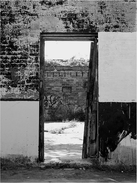
I like this composition. YOU seem to have lost highlight detail in the brighter areas of the image and the texturs of the gray walls isn't as clear as it might be.
I don't think the black and white is working here: everything is too flat. Colour would help us to see the depth. Perhaps even adding a slight tone to the photo might help.






 Add photograph to your favorites
 Add photographer to your favorites


 Photographer found comment helpful.


