The crooked horizon is distracting, as is the overall yellow tint. The focus is a bit soft. You might want to use the USM before saving for the web. A bit contrasty--hard on the eyes to look at for too long.
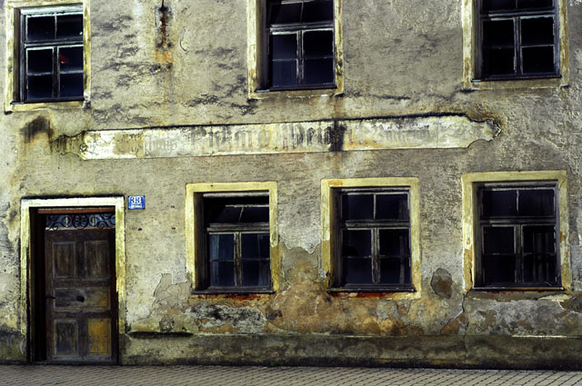
The building has a lot of character, and I like the colors and textures. I would have rated it even higher if it had been level. It could have had a strong composition with the door and the six windows. Hope this feedback proves to be helpful :)
This would be a great image if you paid a little more attention to the framing and tried to get all of the major parts of the image in a better balance. The Focus does not seem right but it may be in the processing that you did. Good try....5






 Add photograph to your favorites
 Add photographer to your favorites


 Photographer found comment helpful.


