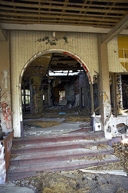
This seems to be following a pattern - too much tilt to the image. In this image, I also think perhaps the left side could have been cropped thru the door frame. There are plenty of other bits of devastation visible, so all of the junk isn't required.
I like this, although it has my head leaning to the left a little. Strong title, which helps add meaning to the image. But even without the title, it has lots of texture, and an interesting array of colors, and designs. <7>





 Add photograph to your favorites
 Add photographer to your favorites


 Photographer found comment helpful.


