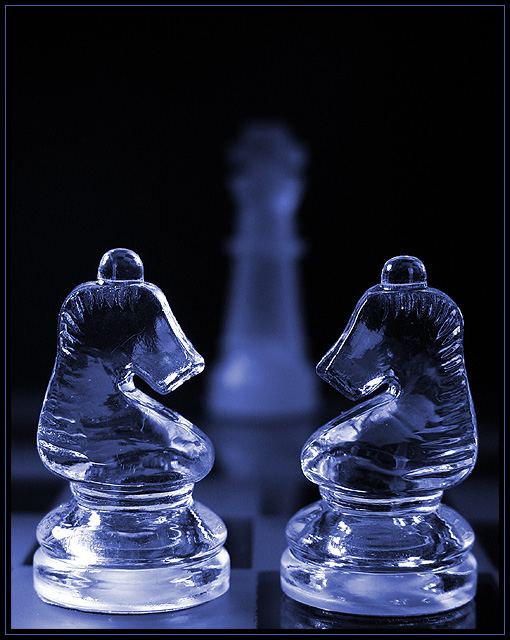
Another addition to my chess series... I decided to try a blue hue rather than a straight black and white on this one. I used a very shallow depth of field to blur out the king in the background. I used the king for the purpose of 'unbalancing' the photo while maintaining symmetry... I traditionally don't like shots that are too symmetrical or over balanced. The decision to use another chess theme was for the purpose of allowing the checkerboard patterns to help upset the balance enough to make a symmetrical photo that I can still like :)
Statistics
Place: 10 out of 226 Avg (all users): 6.5773 Avg (commenters): 7.4118 Avg (participants): 6.3727 Avg (non-participants): 6.8452 Views since voting: 2562 Votes: 194 Comments: 24 Favorites: 3 (view)
this image is excellent .. the clarity and detail in the clear figures is amazing .. i do like the shallow DOF and the play in with the chessboard .. the placement of everything certainly portrays symmetry and the off balance in the background sets the complete composition off nicely ... I also do like the blue tones it gives it a warmer feeling - maybe even a more artsy feel to the photograph than if the shot was done in black and white ... my only thing is that the King looks like its slightly leaning to the right ... maybe it's just an illusion or the piece itself ... either way ... great job .. Ayme
Very nice. Like the lighting and the DOF. Framing is also good with the king in the background. I tried some chessboard shots but they didn't come out this well. Nice work
I really like this photo, the depth and lighting give it a great overall mood. The composition is great, and leads my eyes naturally to the apex of the picture.
It is hard to find fault with a technically superior image such as this. Color, content, clarity, composition, meets the challenge... this one has got it all.







 Add photograph to your favorites
 Add photographer to your favorites


