I really thought this should have rated higher in spite of the lightness. If you ever rework the image, I would love to see the results. This is one of the better composed images in the challenge.
I'd have scored this even higher if the picture had had more bite. It's just a bit washed out for my liking even though I imagine that this was done to give the image an aged, 'times past' look.
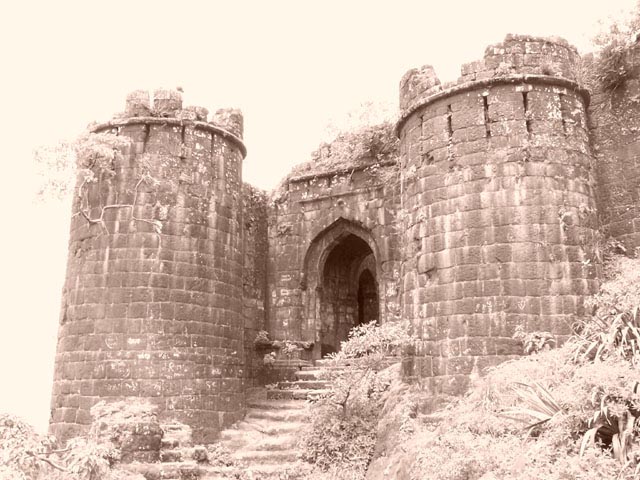
This photo had the greatest of potential, but from my perspective was ruined due to post processing. The magnificence of this structure alone should have put you in good stead with the voters of DPC, but what character the building may have possessed has been eradicated by whatever techniques you used to arrive at this end. It is sad... but as it stands I can only vote this a generous 5.
what a great site. I think you could have upped the contrast a bit, or gone for pure B&W, and it would have been very dramatic. As it is, the sky is very washed out, and that distracts from the rest of the image.
I think you located this shot perfectly. The viewer is 'led up the stairs into the door. I really like the image but wish it was either a little darker or in black and white instead of sepia. Sky looks a little blown out. 7
Nice castle, but the photo seems a bit washed out to me (not sure if this was done on purpose). The top left side takes away from the rest of the picture.





 Add photograph to your favorites
 Add photographer to your favorites


 Photographer found comment helpful.


