Author Thread Comments Made During the Challenge
Post actions
It's Zee
Post actions
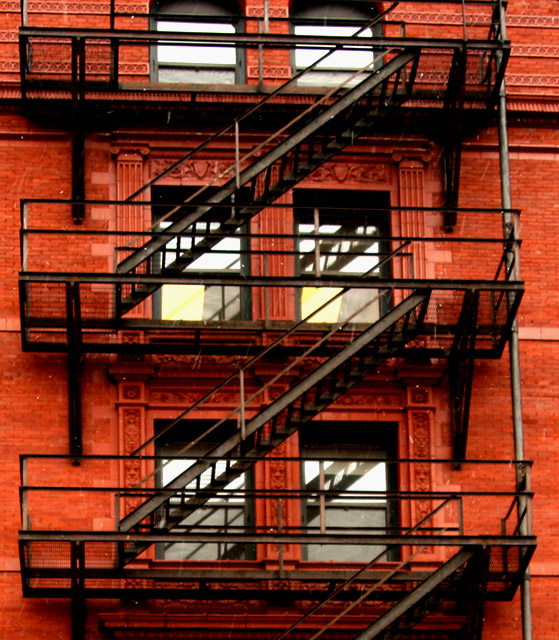
Zed here in Canada. Good colours and composition. Wish it was a little sharper.
Post actions
Good visible "Z", a tad oversaturated for me, not sharp enough IMHO.
Post actions
Really like the color on this one, just looks the slightest bit soft. But, great composition
Post actions
the 2 colours work very well here
Post actions
NIce color, but a little too soft.
Post actions
Nice, nice concept and comp. A little too red though.
Post actions
thats funny i thought i saw this already
Post actions
Would have been better for this challenge if you had cropped it so that there was only one Z, otherwise a really nice photo.
Post actions
Nice idea. The building looks just a little over saturared or something. The focus also looks a little soft.
Post actions
Layers of Z! nicely done!
Post actions
though you have a terrific shot, in visual terms, I feel your photo is too soft and a bit oversaturated (at least on my monitor it appears to be so). Neverthless, it stands out.
Post actions
nice capture, but lacking in sharpness. try a USM filter at 100%, .5, 0.
Post actions
seems a little out of focus. Good eye though!
Post actions
interesting subject, not very detailed
Post actions
Post actions
Would've framed a little higher to get the top two windows.
Post actions
The focus seems a little too soft
Post actions
well you probably should have titled it "is it zee or zed" Either way, the colours here are great - good choice of subject, sadly, the shot is a bit out of focus and it would be a little better if you rotated the stairs just a little, so they were horizontal.
Post actions
You mean Zee or Zed? I think the red on the walls is overpowering what I should be looking at here. But yeah, I can see the Z.
Post actions
If I tilt my head, it's "Ned" ;-) I like this one.






 Add photograph to your favorites
 Add photographer to your favorites


 Photographer found comment helpful.


