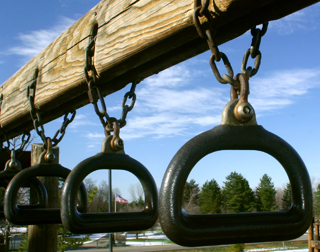
nothing wrong with this pic, great colors, great detail. BUT.. the pole behind the 2nd bar is distracting. Also the rusty right hand corner. Photoshop it out and you will be amazed how the Flag will be enhanced as will the overall pic be.
I love the "D's," but the composition isn't quite what it could be. Maybe if you had zeroed in on the biggest one in front with the trees in the center and cropped out the others, it would have been more special. Just a thought. It's still interesting, though, as is. Nice color and clarity.
I'd have chosen a lower perspective to fill the background all the way down with blue sky. Nice idea though and a great composition. Lovely detail on the metal and wood. 8.





 Add photograph to your favorites
 Add photographer to your favorites


 Photographer found comment helpful.


