Challenge:Symmetry (Classic Editing) Camera:Nikon Coolpix 5700 Location: Home in Atlanta Date: Mar 27, 2003 Aperture: f/3.1 ISO: 100 Shutter: 1/12.5 Date Uploaded: Mar 28, 2003
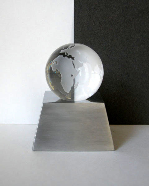
Nice idea but the lighting isn't brash enough to really make the best of it. I think I'd have moved in closer and perhaps lost the floor/tabletop in order to focus on the globe which really is the star of this show. I think then I'd have darkened the room around and used a strong light somewhere behind and left of the globe to really get the light streaming through the glass. The trick here will be to keep the light in the white half and off the black half. Altogether a really interesting subject and great idea. Well done. 7 - floyd
The tones aren't quite right for me. I;m expecting to see true black/white, but the colors seem muddy. There's also what appears to be noise/grain on the black part of the background. The whole image feels excessively soft fo me. But I do like the concept and your choice of models.
Very nicely done! Suggestions would include working to reduce or eliminate the shadow on the right side of the stand, and to make your black background more completely black.
this truly had potential. I think there may not have been enough of light, and maybe you had to over adjust it in post processing? Great idea! I'd like to try something like this sometime. and this image can really make a statement. My suggestion would be to use better lighting.. then, come in close in order to frame it without the stand. cut white and black paper to fit around the base of the globe to make it look floating? worth reworking. :0)







 Add photograph to your favorites
 Add photographer to your favorites


 Photographer found comment helpful.


