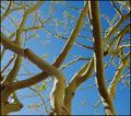
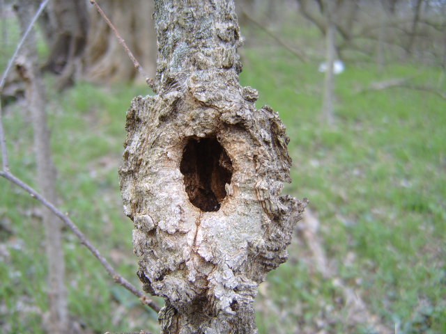
Like your "O," but the light is pretty flat, and I think I might have zoomed in more on your "O" and cropped it more tightly because, after all, it's your star!
Lighting seems harsh. not much contast between the branch or tree and the background. It may have been better to not put the letter dead center in middle of the picture.





 Add photograph to your favorites
 Add photographer to your favorites


