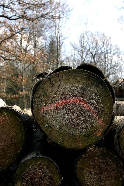
Took a shot of a pile of logs for the letter o.
Didn't crop it, but I used auto level and contrast. A little curve, then in colour balance I +16 cyan-red, +17 magenta-green and +6 yellow-blue. I then went into contrast and put it up to +16 to make the logs darker and more contrast.
Statistics
Place: 244 out of 270 Avg (all users): 4.2056 Avg (commenters): 3.5000 Avg (participants): 3.9060 Avg (non-participants): 4.4118 Views since voting: 847 Views during voting: 365 Votes: 287 Comments: 6 Favorites: 0
The O is too obvious a letter for me, as it can be found almost anywhere. Circles are common in everyday life. Your DOF is not so good, the background is too important to be out of focus. You need a higher aperture. 4.
Too dark, and grainy for my tastes. It fitts the challeng but I don't find the compoasition to be very flattering to the subject, I think I would have used a slower shutter speed and a bit more flash to make the rings of the tree pop a bit better.
The red line on the log is a bit distracting, although this shot meets the challenge overall it isn't very interesting in my opinion., maybe if there were more contrast or colors in the sky...






 Add photograph to your favorites
 Add photographer to your favorites


 Photographer found comment helpful.


