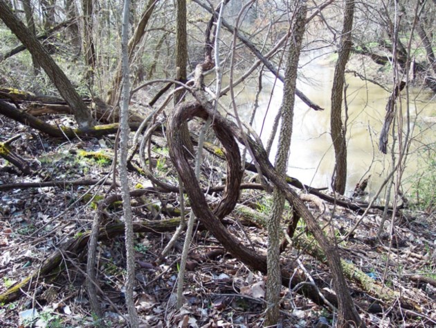
I think that the 'cursive e' is clear in the photo, but there are definately a lot of distracting surrounding elements. The photo is very cluttered with other trees, branches, sticks, leaves...etc.
The entire photo is all a very similar color. Muddy brown. That lacks visual appeal to me.
I am not sure how you could have captured this shot without the other elements or with any variation in colors, so I don't think that this shot could be improved upon. I think that the best decision here would be to have chosen a different subject.
Focus seems a tad soft, I think I would like to have seen some detail in the bark. A crisper focus with a little lighting ON the subject could have brought out some more detail.
Overall I like the cursive e, it is definately original, but the photo of the cursive e just doesn't draw me in.
~Heather~
This is a nice shot. I like how you were able to capture a cursive E instead of just a simple normal E. I also like the background and surrouneings in this image. Nice work.






 Add photograph to your favorites
 Add photographer to your favorites


