gloda wins the prize for getting the explanation of the 550 high correct - I find that anything bigger requires me to scroll, which means the impact of an image is lost.
So that it fits exactly onto my screen in Firefox :)
A great picture, I was surprised when I read it's a seed, I thought it was a flower! Well, a brown flower... Anyway, it's well executed and very creative. Congrats on your 8th finish.
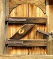
Scored this highly, even though I did not see the "K" until after voting had closed. The "K" is worth looking for here - a deeper, more rewarding picture than many on this front (as well as technically excellent).
Why is it 550 high, and not 640 high??? Waste of 90 pixels of detail vertically, amounting to about 1500 pixels in total, that could have made a significant difference!
More "X" than "K" (or a perfect capital "J" if cropped down the middle). The uneven lighting is a bit disconcerting, but it's a lovely image nonetheless.
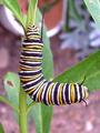
This is cute..and the first K i have seen! I like how it looks very realistic. I also like how the green behind just fades back into the picture. Nice shot,






 Add photograph to your favorites
 Add photographer to your favorites


