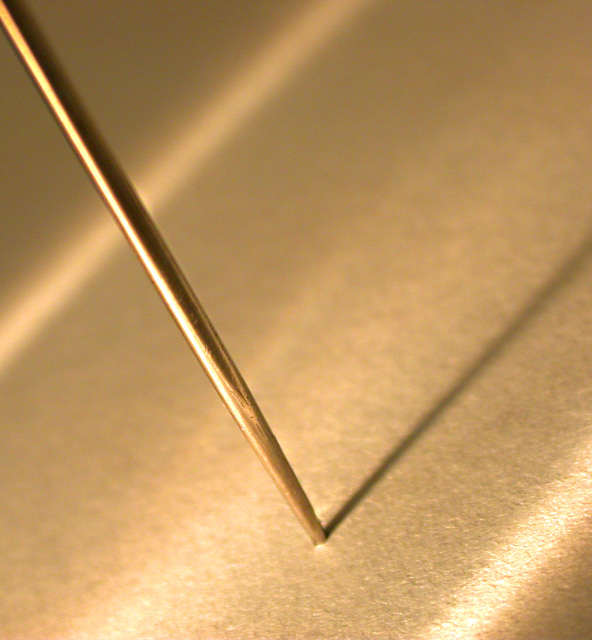
Composition: The first thing one notices is the unusual angle. I like unusual things, but I looked at the photo for quite a while and couldn't see any purpose why you did that. Unfortunately your "photographer's comments" were empty, too. Well, in fact I think the photo would look better when you would have used a normal angle and didn't rotate it. The subject is very banal and the photo looks more like a "study" of the pin. The unusual angle distracts and takes the viewers interest away from the pin. I think a banal angle would fit to the banal subject more. Otherwise a good simplistic photo.
Lighting: I like the lighting on the pin itself, it shows the nice metallic texture very good. I also like the different shades of light and the shadow in the front of the photo. However, I think that the lighting streak in the background is distracting from your subject. It's even worse because it goes right through the pin and cuts it.
Personally I think the photo would look better if you would add more contrast. Then also the colour would come out a bit "warmer", more golden.
Focus: A very narrow depth of field. I know macros have a narrow DOF but for f/4.9 that's very little. I see the lower part of the pin in focus and the upper part out of focus. Both I like. But the very bottom part of the pin is out of focus, too. That's the point where the pin pierces through the paper. I think that's a special point of interest and that also should be in focus.
Challenge: It fits to the challenge well.
Creativity: Interesting choice of subject. Trying to photograph something ordinary in an interesting way. Unfortunately the angle (in my opinion) destroys the ordinary look of the pin but doesn't make it more interesting.
I put a modified version of the photo here. I rotated it, cropped it and increased the contrast. Feel free to send me an Email if you want to discuss your photo more.
Here's an example of an overall excellent image. Lines, details, sharpness, depth of focus, lighting are all so well done. You obviously "felt" this one and it clicked. This one just works and is very enjoyable to look at.
Looks like its just a pinch out of focus. Great idea. I'd have framed this just a touch more to the right to bring the pin decisively beyond the halfway point






 Add photograph to your favorites
 Add photographer to your favorites

 Photographer found comment helpful.


