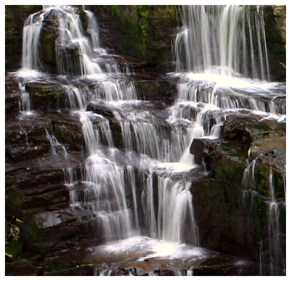
Congrats on top ten. This was not a pic that I had rated on first glance (shows what I know!) - but grows on me with reflection. Feels slightly off balance (about 3 degrees CW rotate required to even out water flow in top RHS). High contrast important for the "V", but maybe slightly too strong for the pretty picture effect.
Personally, I almost always vote a border slightly down unless it works really well (in which case no conscious improvement or deduction to my vote) - I like to judge the image and the 1 pixel black border is usually enough for me. Think that there are more voters like me - not sure if we outvote the border-lovers or not...!
Congrats on your top ten finish Steve.
This is such a beautiful spot to photograph, and you captured the challenge well with your submission. Nicely done.
This is a wonderful find! Most creative 'V' in the challenge and I think it will do well (top 5 at least). Of course that's just my opinion. ;^) I like most of this photo...if I could offer any suggestions I would say that it's just a tad dark and the rocks could be sharper. 8
I have problems with falling water, it never seems to come out right. So when I see a good study like this - it is appreciated. Not the best I've seen, but pretty good.
Wow this is gorgeous! I love waterfalls...and the V looks so realistic. Nice way to captire the image!..I really like this photo and the water looks great.
This is a very nice image. I love the way the water looks in this image. I also like the fact that the image has darks colors and then the letter itself is a light color. Nice work.





 Add photograph to your favorites
 Add photographer to your favorites

 Photographer found comment helpful.


