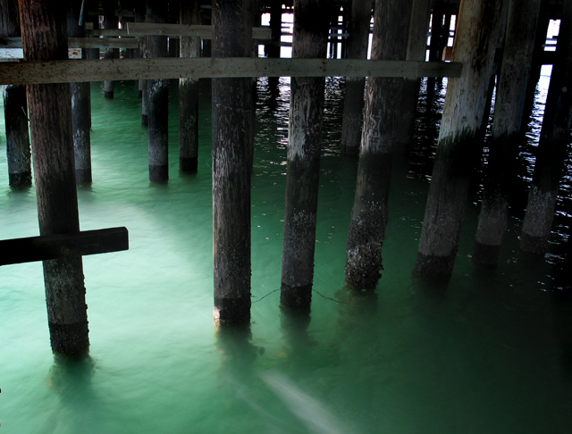
The water colour is cool and the t looks so accidental - just whats needed. Maybe a little more cropping is needed to cut out the some of the unnecessary detail - maybe.
Very much like the way the light plays on the light green water, and the mood that it creates under the wharf. Also like the highlights on the water in the background. I feel like I'm under there. Nice job.
i could have done wtihout the last 3 posts on the right. would have liked it more with those cropped out. still a great shot. i love the way the light goes throught the water.
I'm not sure which letter or letters you tried to depict (I see an F and one or more H's), but i like your photo - especially the water color and light - even though I'm not thrilled by your composition.
This is a nice iamge. I liek the coloring of this image. i also liek the shadow and darkness seen in this image. I like the textures you can see as well. Nice work.







 Add photograph to your favorites
 Add photographer to your favorites


 Photographer found comment helpful.


