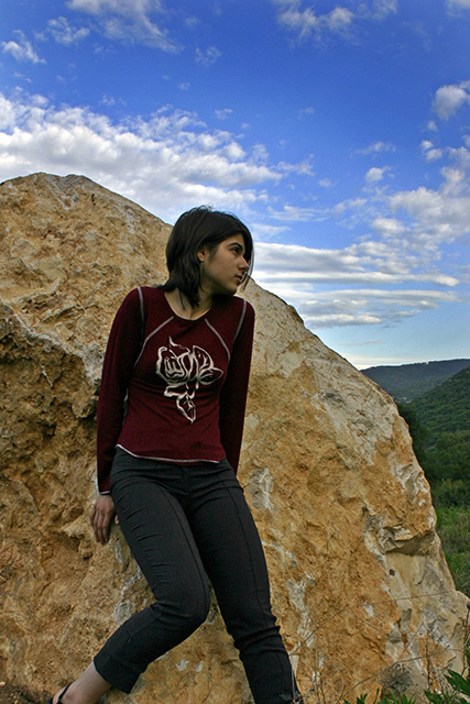
this image looks to have potential, but i'm not too keen on the cropping or perspective. it also seems to be a tad dark. you might have found a stronger image if you had moved a bit to the right, and shot from her torso up, including only the rock and sky for background. just my opinion, though. all the same, you have a nice image, and i hope it does well for you. good luck!
Photo looks overprocessed, as if bringing out shadows has been overdone in PS CS. Compositionally, the edge of the rock cuts the girl's face in half which is not effective. The heel of the foot at the bottom of the frame gives the impression that the feet are missing my accident and not design. She needs to be more on the left of the frame, to give space in which to look into.





 Add photograph to your favorites
 Add photographer to your favorites


 Photographer found comment helpful.


