Author Thread Comments Made During the Challenge
Post actions
Post actions
ooroginal thinking for this challenge. 9
Post actions
Very noisy. Top of head cut off. Could have been so much better.
Post actions
a little out of focus and hard to imagine the letter but an interesting perspective non the less.. keep shooting!
Post actions
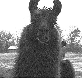
The image is very granular. I get the impression that this has been enlarged from a smaller image
Post actions
Cute! Would look much better if it was sharper and had more contrast-looks washed out. Also, it's too small.
Post actions
the U is incomplete and it sems to me not the main subject of the photo
Post actions
the picture looks like it was taken with a camera phone or something. not good quality at all.
Post actions
It's a fun and creative "U," but the photo is blurry and drab looking. Needs more contrast.
Post actions
I thought this was too graining and lacking detail.
Post actions
Very creative! I really like this picture. I feel like it's a little small and a bit grainy though. I would have likted to see it bigger and clearer. Great idea though.
Post actions
wow there is alot of noise in this shot (possibly intentional) also a bit small.
Post actions
This picture is pretty grainy and rather small.
Post actions
Post actions






 Add photograph to your favorites
 Add photographer to your favorites


