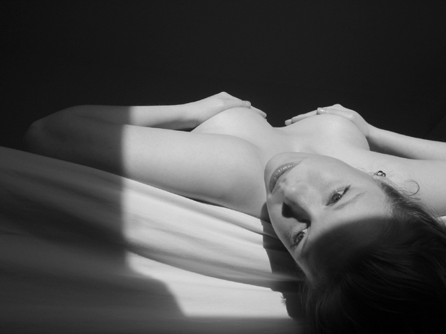
and i like her hands...
she wanted it that way, so that looks perfect on her...
i don't think that this photo would look so complete without her hands... she would'nt be relaxed enough...
The only reason I'm not scoring this that extra little bit higher than I already am is because of the shadow across her forehead. The one running across her arm is OK, because I can still make out the arm in the shadow, but the one across her head simply bothers me. I really like the shadow of her eyelashes and the nice composition. It's just that blasted shadow.... :-)
This is a good shot. The lighting is very powerful and the composition is nice. Something doesn't sit exactly right with me though. After thinking about it all week, the best way I can describe it is the overall image is "soft," but the way she is holding her hands to cover her breasts is very flexed -- angular and sharp. It gives the impression that she is nervous about posing. maybe relaxing the hands. The expression on her face says, "I am alone in my world; I am reflecting on my world," but her hands say, "This is a picture going international on the internet." How to fix? I don't know without totally ruining the composition. MAYBE if you could have shot at a more upward angle so that she wouldn't have to cover herself, or flattening her hands some. Maybe from the same vantage point, but cross her arms over her like a hug. Then the picture may have given the impression that she has lost something important and is contemplating it. I don't know.
Someone here is luckly, and it aint me. Serioulsy though, well lit, good framing, nice focus. I doubt she would have let you hang her from the ceiling (j/k) so this is the next best thing.
This is one of the best executed upside down picture in this challenge. I hope that voters can see the artistic value. Beautiful! I especially like you use of light and shadow to bring the focus to the womans face.
Great tonal range. I like the framing effect of the shadow and dark background, and you seem to have posing well in hand {ahem}. This should do very well, but I bet you get a lot more silly comments. Applaud your bravery. Using the highly scientific hold-your-hand-over-the-monitor technique, it looks like cropping right from the bottom of the angled shadow makes a nice vertical composition, as well. My favorite (right after mine).
This is very nice... The lighting is also excellent... The skin tone and smoothness of the lighting on the skin adds a lot to this photo. I am wondering what this shot would look like if it were panned to the right a tad to capture more of the light, yet leaving the shadow on the left intact, but just less of it... excellent work! Kudos to the model too :)
This is the winner of the week I think. Two 10's from me this time, and one of them to you. I'm a bit afraid that the next few challenges will be full of nudity after the success of this one. Is this by Gordon McGregor? I love your work...
Pretty girl and I love the B&W. Nice comp. Your light/shadow is wonderful. I'm just a bit bothered by the shadow on her forehead. Still this is lovely and I like it very much. Score! for beauty.
This is a wrenchingly beautiful photograph. The only thing that gets me about it is the coyness of covering the nipples... it makes it seem self-conscious. The nipples themselves would add a great element to the outline of the breasts too... although I know that if they weren't given some support, her breasts would fall towards her armpits (I know, I have a pair myself as I commented on the hooters girl photo in the last challenge :). Still, 10 from me.






 Add photograph to your favorites
 Add photographer to your favorites


