Levels, some burning (thanks Pedro, for the tutorial), usm, cropped, resized, added border, saved for web.
I have to thank Librodo for his help, support and critique.
I reworked this photo excactly 15 times before I got tired of it and submitted this.
Model is Tamara, also used her for Color Studio portrait and Selective Desaturation (my first submission)
I hope it does well, we had fun creating it and I hope you enjoy it too.
Statistics
Place: 13 out of 507 Avg (all users): 6.9383 Avg (commenters): 8.1905 Avg (participants): 6.8936 Avg (non-participants): 7.0909 Views since voting: 7475 Views during voting: 419 Votes: 243 Comments: 52 Favorites: 12 (view)
Well, here we meet again. Pulled your shots one right after the other.
There are 3 things that stand out to me in this photo that I might have liked to have seen done differently.
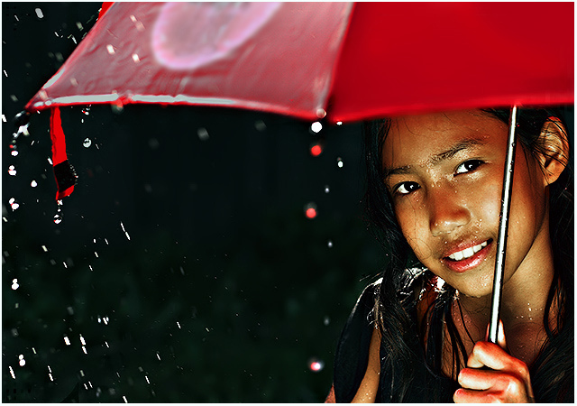
First, the lighter colored circle on the umbrella stands out like a sore thumb. Quite distracting in my opinion. Once I notice it, it's like that's all I can see when I look at the photo.
Second distraction is the red tie hanging down on the left. That is a brighter red in comparrison to the umbrella and again, stands out a lot.
The third thing is her hand. It is a different color than her face and is a reddish color (probably reflection from the umbrella?) but it is deffinately not natural looking.
Focus and clarity are right on. Wonderful job.
Adorable model, lovely expression and pleasing to look at.
The background is perfect, nothing distracting there. DOF is great. I like how the girl is in focus but the other elements of the photo are blurred. Lighting on the girl is wonderful.
Very visually appealing, I could look at this for a long time. Longer if the light circle were not on the umbrella. :)
~Heather~
Edit to add that even in the thumbnail, it is the light circle that I notice first, and then the girl.
ppff weer een geweldige foto peter!! en 13de van de 507 is een erg mooie score lijkt me zo :D En die 2de ribbon zit er wel aan te komen hoor
Laatste free study was ik 4e van de 488. En dit is echt vele malen beter als die stomme molens, maar ja, zo zie je maar weer, je weet het nooit op DPC.
One of my favorites. I would have reduced the red in the hand holding the umbrella. outside of this the image projects great charm and the sense of rain with a vibrant smile peeking out.
I think the lighting on the girl is fantastic given it's dark and raining. I like how your eye goes up the umbrella handle and is carried across the screen by the umbrella. Nice composition, and nice cropping.
shes got a hole in her umbrella....shes all wet. lol...only joking, this is one of my top scores for the challenge. nice sharp focusing. great framing. could easily win a ribbon? 9
Wow! A stunning piece of work. Fantastic sharpness, lighting, sense of motion from the water drops, and composition. Rich, saturated colors - yowza - you could make big money from this gorgeous image! I wish I could give an 11! 10
I like your composition here, but the colours and contrast don't quite do it for me. I think a tighter crop just below the logo on the umbrella would be more powerful though.
Her expression is lovely but I'll be honest, I don't really know what this is supposed to do for me. It's a nice portrait of a girl but I don't really connect with her and I find myself viewing this more as a piece of stock art rather than a human study. If she was looking downwards I would feel more like an observer which, for me, I would prefer. I'm also not convinced by the 'rain' which does look quite isolated to the left.
It is however, a well taken shot bya proficient photographer.
I love the color and composition of this photo. I scored it a 10 but then I was admiring it again and noticed in the left side of the frame there is some weird stuff going on with the rain and the umbrella. bummer.







 Add photograph to your favorites
 Add photographer to your favorites

 Photographer found comment helpful.


