Author Thread
Post actions
Comments Made During the Challenge
Post actions
Post actions
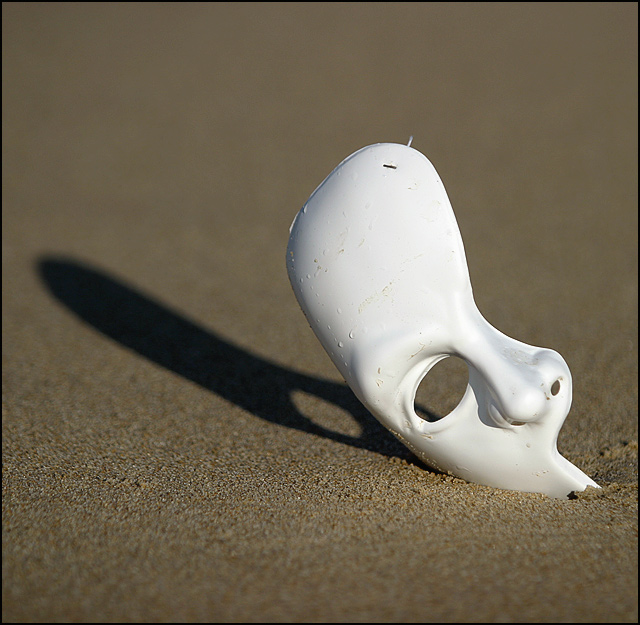
i really like this shot, one of my favorites so far. i do think it could have been a little better with a little more dof.
Post actions
great idea - technically a great picture. Prop lets you down very slightly - water droplets, sand and twig on mask detract from the image - only an issue because of the minamalism of the piece.
Post actions
It looks as though that plastic that held the price tag is still there on the top right of the mask. Other then that nice shot
Post actions
Great visual interest, perfectly focused and exposed. I would prefer greater dof. ....8....
Post actions
nice composition -- doesn't say in the beginning to me, but nicely shot.
Post actions
Very strong image I like the lighting and contrast
Post actions
very nice, should be in top three 8
Post actions
not original but good idia i will give it 5
Post actions
I like the smoothness of the sand and the overall contrast of the photo. I couldn't see the relationship to the challenge however.
Post actions
Post actions
This is definitely one of the most interesting of submissions. I like it. Very nice composition.
Post actions
Wonderful. You've captured great beauty with this one.
Post actions
a good photo, that distinct cut off point of out of focus on the bottom should have been cropped off so there aren't two areas that are unfocused. just makes the image loook weird.
Post actions
Post actions
I really like this too bad you can see string and staple 8 any way







 Add photograph to your favorites
 Add photographer to your favorites

 Photographer found comment helpful.


